
Imprint: The content of this blog entry is based on VR experiments in the context of projects carried out in the scope of the authors masters degree studies at FHNW University of Applied Sciences and Arts Northwestern Switzerland under the supervision of Prof. Dr. Doris Agotai.
To visualize data means to form a mental model or image of something in order to gain insight. One particular way for doing this is by mapping, which is defined as “creating a graphic representations of information using spatial relationships within the graphic to represent some relationships within the data. The common and original practice of mapping is the scaled portrayal of geographical features, that is, cartography. In the contemporary sense of data visualization, it includes metaphorical extensions of geographical map conventions and literacies to other kinds of data, as well as innovative ways of visualizing data not clearly related to the geographical archetype. In popular vernacular, mapping can just mean organizing or systematizing information” [1]. Hans Ulrich Obrist further defines maps as “an abstraction of the physical or conceptual world – a symbolic depiction of a space or idea that allows one to understand and navigate an unfamiliar topography or complex topology. But while most conventional charts, plans and diagrams claim to offer an accurate, even objective picture of the world, each one is bound by the specific agendas of its creators and users” [2]. He points out that there is no neutral way for mapping data and stresses on the importance to carefully consider and choose factors such as visualisation methods, styles, type, medium and context when representing data because they influence how the data is perceived. Jay David Bolter writes in the context of medium and materiality that “the computer is not a neutral space for conveying information. It shapes the information it conveys and is shaped in turn by the physical and cultural worlds in which it functions” [3].
Geographical Maps
Maps and globes are widely used for visualizing qualitative or quantitative data with a spatial aspect. The choice of map projection type is one of the initial steps in the quest to represent the world, a sphere, on a flat planar surface. No projection is neutral, natural or given, they are all constructed, configured and underpinned by various and quite arbitrary conventions. The main distinction is made between conformal maps like Mercator’s projection and equal area maps like the Gall-Peters projection. The former has the appealing property of faithfully representing the shapes of regions on the map and has served as standard for atlases for centuries. It is fine around the equatorial areas, but it greatly exaggerates the sizes of features as it nears the polar regions. [4] The later depicts sizes accurately, the area covered by a feature on the map, is proportional to the true land area of the feature in real life, but now the shapes are distorted, again this distortion is greatest near the poles.
In between the two of them lies another common choice, the equidistant cylindrical projection (plate carrée). This projection gets neither the areas nor the shapes of map features correct, but adopts a compromise solution that distorts neither areas as badly as Mercator nor shapes as badly as Gall-Peters. [5] There are many other projections of the world, but all of them inevitably distort our view of the world because it is not possible to draw the surface of the earth on a 2D surface without significant spatial distortion.
Maps and Globes in VR
In contrast to the challenges of representing the world on a 2D medium outlined above, VR would allow to represent the world correctly in its original spherical shape. A key question however is if virtual globes are the best way to show global geographic data in immersive environments or whether maps or some other visualisations may be better. Some of the drawbacks are that a globe can only show one hemisphere which is a limitation for many global visualisations and another observation is that the unfamiliarity with this perspective leads to disorientation of users. In their paper “Maps and Globes in VR” the authors explore different ways to render world-wide geographic maps in VR. They compare the pros and cons of the 3D exocentric globe (user’s viewpoint outside the globe), the egocentric globe (viewpoint inside the globe) and the flat map and it’s variant the curved map (rendering map on a plane or section of a sphere). [6]

Figure 1: Different apporaches for mapping the world in VR proposed by Yang et al. in “Maps and Globes in Virtual Reality” [6]: 3D exocentric globe, flat map, 3D egocentric globe and curved map (from left to right). Additionally, the authors present their work in a short video.
Other Types of Maps
As stated in the introduction, mapping can refer to any kind of systematic information visualization where data attributes are bound to visual encodings. Erik Champion states that “maps are not just instrumental artefacts, but also epistemic ones with a long history that have helped to organize our knowledge of the world for millennia.” [7] Besides of geographical maps there is a wide variety of other map types. For instance cartograms, a rather recent invention, are digitally modified maps which depict the areas and countries of the world not by their physical size, but by their demographic importance on a vast range of subjects. Each territory on a map displays its data graphically, becoming larger or smaller in proportion to other areas, which are in turn scaled according to their own data. On a population cartogram a country with twice as many people as another is drawn twice as large. This approach creates unpredicted views of the world and allows new perspectives for mapping the social dimension of our planet. [5, 8] In the context of the Serpentine Gallery Map Marathon Obrist even goes as far as denoting mapping as a curatorial device. [9]
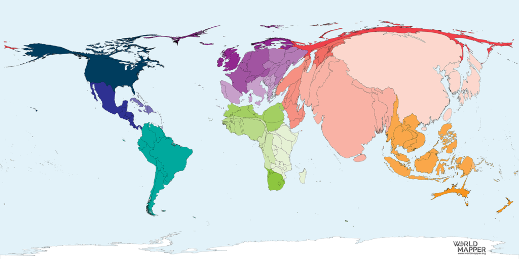
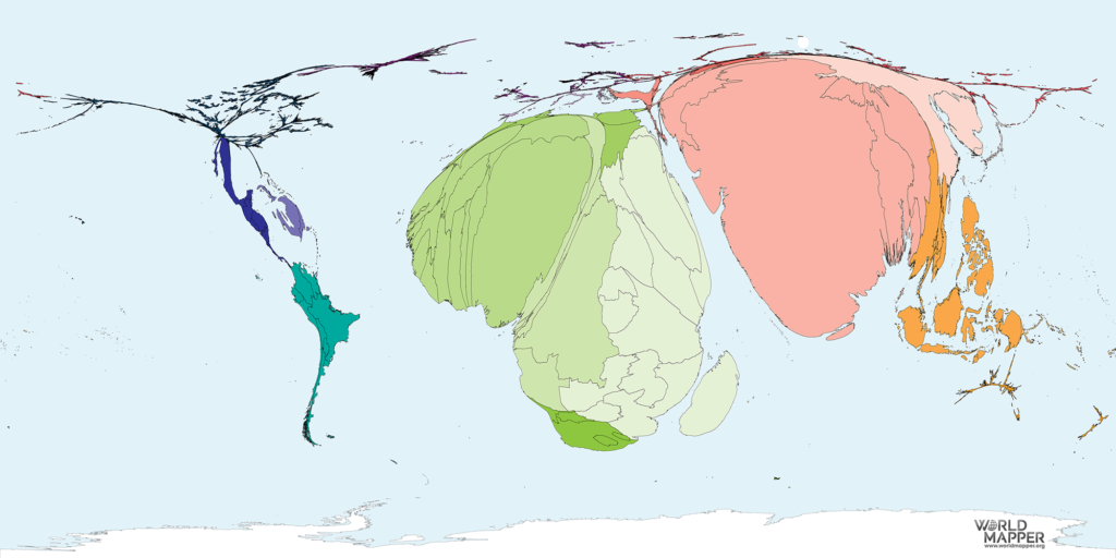
Figure 2: Worldmapper offers a collection of cartograms where territories are re-sized on each map according to the subject of interest. The subject in the examples shown above are Adult Literacy in 2015 and Absolute Poverty Inequality in 2016 [10].
Cultural mapping is a term introduced by organisations like UNESCO concerned about safeguarding cultural diversity to map distinct people’s tangible and intangible cultural assets with locals landscapes around the world. Other types of maps that have no geographical reference at all include but are not confined to the mapping of networks (often in the form of graphs), thematic maps, story maps, mind maps, tag clouds and various forms of text visualisation.
Visual Information Seeking Mantra for Information Visualization
In one of the foundational papers on information visualisation the UI and HCI pioneer Ben Shneiderman introduces the Visual Information Seeking Mantra “overview first, zoom and filter, then details on demand”. He emphasizes the importance of letting the user gain an overview of the entire collection by offering a zoomed out view at first and then allowing him/her to zoom in on items of interest. Moreover he/she should have the capability to filter out uninteresting items in real time by dynamic queries applied to the collection. He stresses that advanced filtering mechanisms should accommodate highly varied user needs regarding filtering features. And finally, allowing the selection of an item or group and get details on demand when needed. He recommends the overview plus detail view strategy, which he also calls context plus focus, and points out that as a consequence there is a need for navigation tools to pan and scroll through the collection [11].
The principles of Shneiderman’s Visual Information Seeking Mantra are applicable to information visualisation in any medium including new technologies such as VR and provide a useful strategy for presenting and interacting with data that is worth pursuing in this project. With regards to the importance of offering a comprehensive overview it is presumed that even though a spatial environment offers features such as a 3D globe, the mapping and presentation of data on a flat map would be more suitable for our use case. Evidently user tests will be needed to verify if this mapping approach contributes to the intended outcome of discovery of insights through exploration of dataspaces by the means of interaction and data visualisation.
[1] Bleisch, Susanne (2018): “TSM Information Visualization – Mapping”.
[2] Obrist, Hans Ulrich (2014): “Mapping it out: an alternative Atlas of Contemporary Cartographies”. Thames & Hudson, London UK.
[3] Bolter, Jay David and Gromala, Diane (2003): “Windows and Mirrors: Interaction Design, Digital Art and the Myth of Transparency”. MIT Press, Cambridge, Massachusetts.
[4] McCarthy, Tom (2014): Foreword to “Mapping it out: an alternative Atlas of Contemporary Cartographies”. Thames & Hudson, London UK.
[5] Dorling, Daniel, Newman, Mark, Barford, Anna (2008): “The Atlas of the real World: Mapping the way we live”. Thames & Hudson, London UK.
[6] Yang, Yalong, Jenny, Bernhard, Dywer, Tim, Marriott, Kim, Chen, Haohui, Cordeil, Maxime (2018): “Maps and Globes in Virtual Reality”. Eurographics Conference on Visualization (EuroVis).
[7] Champion, Erik (2015): “Digital and Non-Digital Cultural Methods For Mapping the World Around Us”. Malta Workshop Knowledge Maps and Access to Digital Archives. URL: https://de.slideshare.net/nzerik/digital-and-nondigital-cultural-methods-for-mapping-the-world-around-us
[8] Hennig, Benjamin D. (2014): Chapter “Redrawn Territories” in “Mapping it out: an alternative Atlas of Contemporary Cartographies”. Thames & Hudson, London UK.
[9] Serpentine Galleries: “Map Marathon”. URL: https://www.serpentinegalleries.org/exhibitions-events/map-marathon
[10] Gotthardt, Tina and Hennig, Benjamin: “World Mapper”. URL: https://worldmapper.org/
[11] Shneiderman, Ben (1996): “The Eyes Have It: A Task by Data Type Taxonomy for Information Visualizations”. Proceedings 1996 IEEE Symposium on Visual Languages.