
Imprint: The content of this blog entry is based on VR experiments in the context of projects carried out in the scope of the authors masters degree studies at FHNW University of Applied Sciences and Arts Northwestern Switzerland under the supervision of Prof. Dr. Doris Agotai.
Because maps are something most users are familiar with and therefore offer a natural interface to access and explore the given data set, we chose to pursue this scenario for our initial prototype. In this article we give reason for the design decisions that were taken over the iterative implementation process of this prototype.
Map representation
We have discussed various forms of representation of the world in VR space in a previous article and observed that it depends on the objective of a VR experience whether virtual globes are the best way to display global data in immersive environments or if other representations are more eligible. A significant limitation of globes is that only one hemisphere can be observed at once and another observation is that the unfamiliarity with this perspective leads to disorientation of users. Given the objective of fast perception, we concluded that the presentation of data on a flat map offering a comprehensive overview is more suitable for the given use case.
Navigation in the virtual world
A further general design question regarding the map representation is whether the map should be positioned below, in front of or tilted towards the user. This question is closely related to how the user should navigate around the virtual world. Having the map on the ground allows for more natural forms of spatial movement such as free walking (thanks to the support of physical locomotion in room-scale VR setups) and locomotion by the means of teleportation. And zooming between overview and close-up view can happen by allowing the user to be lifted up and down. Flying up naturally offers a bird’s view perspective whereas lowering down brings him/her to ground level view.
In contrast, when the map is in front of or tilted towards the user, he/she would float in space and other less natural and therefore presumably less intuitive navigation concepts – for example via indirect navigation through an input device such as motion controller or joystick – would be required for all directions of locomotion, specifically the vertical and horizontal movement in front of the map as well as for the “zoom factor” which is realized by moving closer towards or further away of the map.
Some of the benefits of simpler navigation and interaction techniques in regards to usability and user experience are that they are faster perceived and mastered particularly by inexperienced VR users such as the target group in our usecase, that they require less cognitive effort in the execution and consequently offer a more pleasurable spatial experience. Additionally, being in the world and being able to freely move around offers a higher degree of immersion and overall supports better the explorative approach pursued in this project, allowing the users to gain spatial memory and understanding about the dataset and eventually discover their own insights.
Design of the map
There are a number of design question in regards to the visual style of the map:
- What is an appropriate level of detail for country shapes? On a side note, it has to be considered that this is not only a design but also a performance question…
- Should the countries have outlines or gaps to indicate the borders? And if so, how do we keep a consistent visual impression as users are looking at the map from different perspectives? A gap could look immense from a close up perspective, but be hardly recognizable from far away and the same applies to outlines. To deal with this challenge a concept was applied that is similar to the zoom level technique of geo information systems where, depending on the current zoom level, cartographical material or orthophotos with a different levels of detail are displayed. Country outlines with different line thickness tailored to the viewing distance of the user are dynamically loaded to convey a consistent visual language from every perspective.
- Will the shape alone be sufficient for the user to recognize the country or is additional information such as a label with the country name, country code or a flag needed? And in case of a label, additional points of discussion include aspects such as if the full country name should be displayed and if so, in what language should the names be displayed (e.g. english or local language)? How to deal with autonomous regions like Tibet for example? Where to display the label in the case of countries with a rather small surface? How can the reference to the corresponding country be ensured if placed next to the area or would the country code alone be understandable for the majority of users? How can the legibility be ensured given that the user looks at it from different angles, distances and changing background conditions. Some approaches to deal with this issue is to to adapt the font size to the users distance and to adjust the orientation of the text towards the viewing direction of the user, which is a technique that is often used in VR and commonly referred to as camera facing billboards.
- Additionally it needs to be determined what is the right measure of information density in each situation and for the given use case in general. For example should country labels only be displayed for countries that are of particular interest for a user at that moment (for example those closest to his/her position or those with the largest amount of collection items)? Or should collection items which are close to each other be displayed as clusters in the overview perspective in order to to prevent information overload?
Data visualisation and interaction with the dataset
Our data visualisation concept aims to combine the visualization of information about the dataset as a whole with detailed information about specific data points and therefore operates on two layers: the former is incorporated into the map visualization and the latter is represented in the display of the individual collection objects as shown in the following figure.
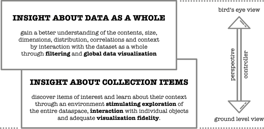
Figure 1: the two layers of the data visualisation and interaction concept of the Worldmap Data Exploration Prototype.
In order to provide a fast overall impression about the contents of a given dataset, aggregated general information about the dataset such as the prevalence of objects matching certain criterias is directly embedded into the map representation itself in the form of a Choropleth map colour encoding in combination with volume height adjustments. While visualizing quantities through the height dimension might seem to be the most obvious form of spatial data visualisation, it should be noted that this form of expression alone might be difficult to read because scale variation makes judging distances, heights and areas in 3D space harder, and occlusion might at times remove relevant information from the field of view. Therefore, a combination of spatial data representation together with a visual encoding in the texture of the surface of a geographic object provide a more effective solution allowing fast interpretation of data. In concrete terms, this means that the texture of countries with many collection items on display is highlighted and the height of the 3D models of these countries is elevated.
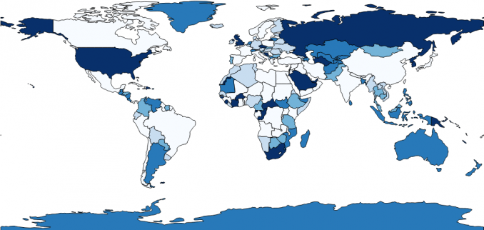
Figure 2: A choropleth map is a thematic map in which administrative areas are colored or shaded according to the range in which the aggregated statistic of interest falls. The example shows the length of countrynames, lighter shades are indicating fewer characters, darker shades a greater amount of characters in the countryname. [1]
Additionally, interaction with the dataset is an essential factor for gaining a better understanding of its content. Our approach is to allow the user to filter the dataset by various criterions such as time span of creation, material, geographical origin, etc. and apply the filter results in real time to the global data visualization rendering concept explained above. And in addition to the overall presentation, collection items that are included in the selection are highlighted by being expanded. This immediate spatial representation of filter results offers rapid insight on the contents of the dataset to the user.
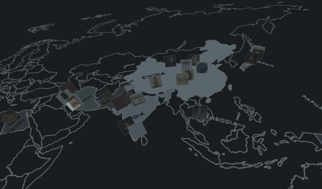
Figure 3: screenshot of the prototype showing the Choropleth map implementation
Visual design
And last but not least there are the obvious design questions regarding the general aesthetic such as overall style, colour schema, lighting mood and so forth which exhibit a certain degree of subjectivity and can be rather hard to measure. Filonik and Baur have researched the topic of measuring aesthetics for information visualization and conclude that “aesthetics is an unsolved problem of information visualization, because there is no satisfactory understanding of what constitutes aesthetic effect”. Yet they also point out that empirical studies have shown a correlation between perceived aesthetics and usability. [2] And Katja Kwastek states in Interaction in Digital Art that “materiality and interpretability should be understood as complementary components of aesthetic experience” [3] confirming that the choice of material and style can contribute to the comprehensibility of the data on display.
The leading design principles for our VR experience are simplicity, information density, focus and comprehensibility.
Simplicity in a broader sense applies to being intentional on how much visual detail information is really required. Lindeman and Beckhaus who coined the term “experimental fidelity” encourage VR creators to carefully curate the user experience yet not by increasing the level of detail, but rather by reducing it to the essential components [4]. And Salen and Zimmerman address this issue in the domain of computer games and use the term “immersive fallacy” to denote the widespread misbelief that illusions should be as realistic as possible [5]. For this reason we intend to apply an adequate level of detail in the visual design of the components. For instance not every minor detail of the world map is needed, simplified shapes and outlines fulfill their purpose (and might improve the performance as a side effect).
Simplicity concerns not only the visual aspect but also an adequate level of information density. According to Claudia Giannetti, the theory of apperception states that a “oversupply” of information causes irritation of the user, whereas “undersupply” can lead to boredom. [6] Dealing with larger amounts of data, the lower bound is never an issue, the challenge is to show just the right amount of visual information to the user to prevent a cognitive overload. It is interesting that the author subsequently recommends to use a multilayer model to keep the right balance between the two extremes which is exactly the approach taken with this prototype.
The virtual environment should not take away the user’s attention from the actual content and colour can plays an important role in guiding the user’s focus. Therefore only the collection items are represented in their original colour to be in the center of attention whereas the chromaticity of the surrounding has deliberately been reduced to grayscale with low luminosity for countries with little or no prevalence of collection items and increasing brightness for countries with higher concentration of collection items.
Last but not least emphasis should be given to comprehensibility. It is important that the chosen forms of visualisation can be interpreted by the target audience, which are by the majority not expert users nor data scientists. While we strive for simplicity and higher degree of abstraction might offer interesting visual appeal, employing familiar forms of representations allow to tap into prior knowledge. For this reason a conventional world map was chosen to convey the geographical context.
[1] GisGeography (2018): “Choropleth Maps – A Guide to Data Classification”. URL: https://gisgeography.com/choropleth-maps-data-classification/
[2] Filonik, Daniel and Baur, Dominikus (2009): “Measuring Aesthetics for Information Visualization”. Information Visualisation, 13th International Conference. 579 – 584.
[3] Kwastek, Katja (2013): “Aesthetics of Interaction in Digital Art”. MIT Press, Cambridge, Massachusetts.
[4] Lindeman, Robert W. and Beckhaus, Steffi (2009): “Crafting memorable VR experiences using experiential fidelity”. Proceedings of the 16th ACM Symposium on Virtual Reality Software and Technology, Seiten 187-190. ACM, New York.
[5] Katie Salen and Eric Zimmerman (2004): “Rules of Play – Game Design Fundamentals” MIT Press, Cambridge, Massachusetts.
[6] Giannetti, Claudia (2004): “Ästhetik des Digitalen: Ein intermediärer Beitrag zu Wissenschaft, Medien- und Kunstsystemen”. Springer Verlag, Wien/New York.